

Leumit
process
LEUMIT
Team: UXpert
Leumit is the 3rd largest healthcare company in Israel. The goal of this project was to create a new easy and intuitive app that would allow the over 700,000 insured users to carry out all their necessary healthcare related actions with ease.
What I did: As lead UX and manager of this project at UXpert, I conducted all the research, transformed complex feature lists into intuitive user flows and designed the interactive prototypes for over 20+ required modules that would later be handed over to the design team.
CHALLENGE:
With such an immense amount of features required from the app, from making a doctor appointment, through approving payments, to accessing information, the true challenge was understanding what the users needed most and designing the information architecture in a way that those features could be accessed easily, without compromising the business goals of the company.
PROCESS
1. MARKET SURVEY
Since the feature list was almost identical to other healthcare apps, I deconstructed all the other healthcare apps to fully understand what they were giving their users and how. This was critical since people tend to move between healthcare companies in Israel and the digital app is one of the most common interface points people have with their company. If this app could outperform the competition, it would give Leumit a big advantage.

2. USER RESEARCH
I conducted user research using three main methods: phone calls, social media questionnaires and focus groups. The three main areas of questioning were:
-
When do people use their healthcare app and for what purpose?
-
What would they change in the app they currently use?
-
In what situation did the current app help or fail them?
3. COMPANY RESEARCH
Understanding the company’s business goals was a key point in getting the app’s structure correct. By interviewing various key figures within the organisation while also researching how they structured information on their website, we got a full understanding of what key points were important for them to put forth to their users - such as additional paid services they want to promote.

4. USER PERSONAS
Based on people we interviewed and statistics we were given on the populations insured by the company, we created five personas representing the prominent types of users the app would have. Using the knowledge gained from the interviews, we were able to write down what main needs each user had and what was the “moment of truth” for them that would show if the app would actually prove useful.


5. BUILDING THE EXPERIENCE
Insights from the research were guidelines for finding solutions and building an optimal prototype.


A few of the main insights and their solutions in the prototype:
Easy login - users wanted an easy login process
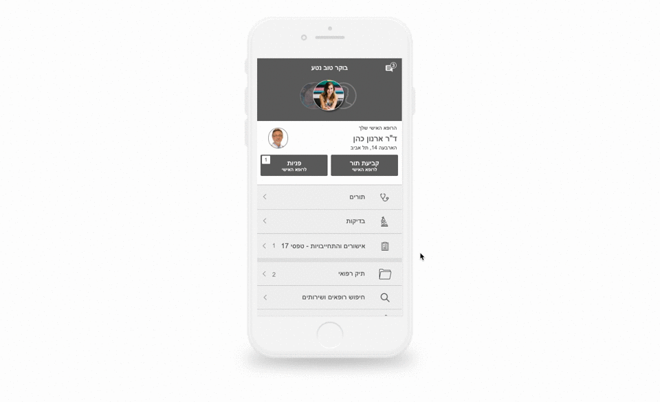
Family access - parents wanted to easily transition between family member’s profiles

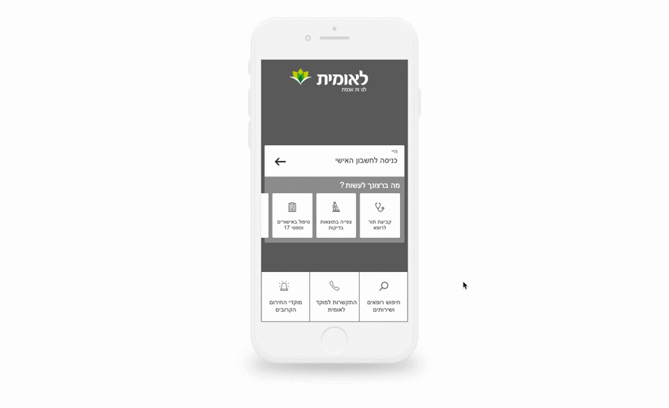
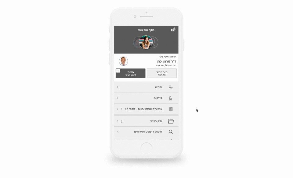
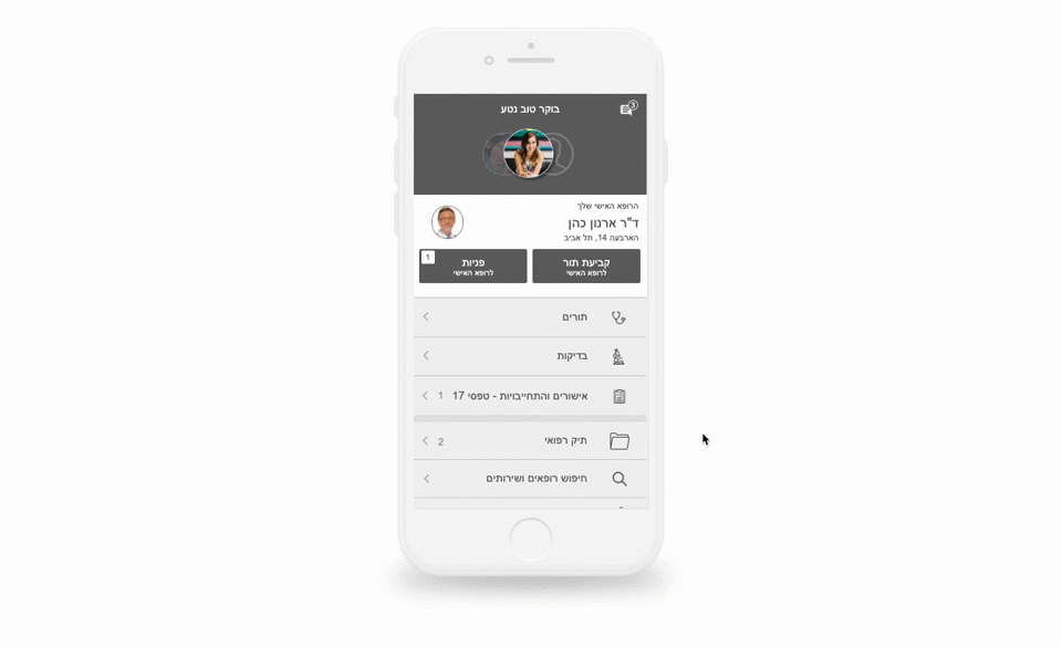
Information Architecture - easy access to the four most common tasks

Navigation - create intuitive navigation within the app, in order to find the correct information.
Less typing - use smart auto-fill guides, buttons and defaults to decrease typing

Future expansion - Build a flexible app that could easily be expanded by Leumit in the future
Business needs - Provide a central area where Leumit could send messages or promote new features.
6. User testing and handoff to design
After months of prototyping, user testing, feedback and redesigning the prototype, we finally reached the layout that was best suited for our users. Now the designers at UXpert were given the prototypes in order to complete the final design
